


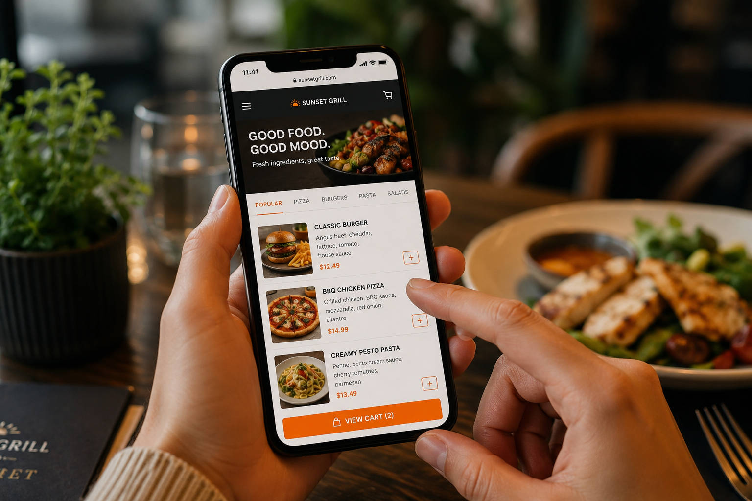
Someone lands on your website hungry, or close to it. They want your menu, your hours, or a way to place an order, and they want it in a couple of taps. If your navigation makes them dig for that, they don’t file a complaint. They just leave and open the next place down the street.
That’s the whole job of your site’s menu: get people to what they came for without making them work. Below is a straightforward guide to building navigation that does that, with a focus on restaurant websites, where “Menu,” “Order Online,” and “Reservations” need to be impossible to miss.
The Foundations of Great Menu Structure
Before you touch colors and fonts, get the structure right. A good-looking menu that points people in the wrong direction still loses you the order.
Master Your Information Architecture
A reliable way to figure out your information architecture is card sorting: you ask real people to group your website’s topics into categories that make sense to them. It keeps your menu built around how guests think, not the internal shorthand you use behind the counter.
You’ll also run into the question of how many items a website menu should have. Miller’s Law is a useful rule of thumb here: keep your primary navigation to around five to seven items. That’s a big part of reducing choice paralysis in navigation. Hand people too many options at once, and they tend to stall out, and a stalled visitor is a lost order.
For most restaurants, those core items are predictable: Menu, Order Online, Reservations, Location/Hours, About, and Contact. If you’ve got more to show (Catering, Events, Gift Cards, Private Dining), tuck those into a secondary spot, a dropdown under “More,” a utility bar, or the footer, so the main path stays clean.
Focus on Clarity and Intent
Lean on user intent-based menu labeling, which just means naming links after what the guest is trying to do. Instead of a vague catch-all like “Solutions,” say what it is. Optimizing menu labels for readability is what lets someone scan your header in a second and know exactly where to click.
Clarity also means consistency. Pick one word per idea and use it everywhere. If your navigation says “Order Online,” don’t call the homepage button “Start an Order,” the footer link “Online Ordering,” and the mobile button “Delivery.” Those small mismatches make people hesitate, and hesitation is where orders quietly disappear.
Prioritize Your Highest-Value Actions
A user-friendly menu isn’t only about helping people browse. It’s about helping them finish the task they came to do. Pick your top two or three outcomes, which for most restaurants are to view the menu, place an order, and book a table, then build your navigation so those feel effortless.
- Make primary actions obvious: A button-style link for “Order Online” or “Book a Table” pulls the eye where you want it.
- Keep the path short: Fewer clicks to the menu page and to checkout means fewer places to lose someone.
- Use plain language: “Menu” beats “Our Offerings.” “Location & Hours” beats “Visit Us.”
Visual Layouts and Discoverability
Design does much of the work in improving the discoverability of website navigation. Nobody should ever have to go looking for your menu.
Choosing the Right Position
There’s a common question here: what is the best position for a navigation bar? Top-right and top-center still win, because that’s where people look first out of habit. When you’re weighing top horizontal vs vertical sidebar navigation, let your content volume decide. A top horizontal bar suits most sites; a vertical sidebar earns its keep on dashboards or portfolios with deep, complex sections.
For restaurant website templates and restaurant homepage design in general, top navigation usually performs best because it matches what guests already expect from the best restaurant web experiences they use every day. If you run a hero image or video, keep the menu links visible, or make sure they appear the moment someone scrolls.
Dropdowns That Don’t Fight the User
Dropdowns can help, but they can also become a headache when they’re too twitchy, too crowded, or hard to tap on a phone. If you use them, keep a few things in mind:
- Stable hover/focus behavior: Don’t let the menu vanish the second the cursor drifts off it.
- Touch-friendly spacing: Space items so a thumb hits the right one without a misfire.
- Limit depth: Two levels are usually plenty. Go deeper, and it gets hard to scan.
Sticky Navigation (When It Helps)
A sticky header cuts friction, especially on long restaurant web page designs where guests scroll past photos, reviews, and a full food menu. Done well, it keeps “Menu,” “Order Online,” and “Reservations” within reach without anyone scrolling back to the top.
Done poorly, it just eats screen space. If you turn it on, keep it compact, make sure it doesn’t cover content, and test it on a small phone.
What to Look For in a Restaurant Website (and Its Template)
Restaurants are a great place to look for restaurant web design inspiration, because an eatery’s site has one clear job: get hungry visitors to the food menu and the reservation system fast, with as little in the way as possible.
Say you want the best restaurant web presence in your town. Strong restaurant website design leans heavily on upfront navigation. Browse a few cool restaurant websites or good restaurant website examples, and you’ll notice the same thing: their menus almost never hide behind layers of clicks.
Whether you’re building from scratch or starting from a restaurant site template, let navigation drive the layout, not the other way around.
Choosing the Right Template
If you’re getting a new cafe off the ground, you’ve got plenty of options. Maybe you’re after a restaurant site template free of charge, or a paid cafe website template. When you’re sizing up any restaurant web page template or broader food website themes, look hard at the demo’s header first, because that’s what your guests will actually use.
What “User-Friendly” Means for a Restaurant Menu Page
Navigation gets people to your menu page, but the menu page has to carry its own weight. If guests can’t scan fast, compare a couple of dishes, or find the details they care about (price, dietary notes, spice level), they’ll bounce, and on mobile, they’ll do it quickly.
- Make it scannable: Clear category headings (Starters, Mains, Desserts), short descriptions, consistent formatting.
- Surface decision helpers: Flag items as popular, spicy, vegetarian/vegan, or gluten-free where it matters.
- Keep pricing readable: Put prices in a consistent spot and skip the tiny, low-contrast type.
- Provide next steps: Keep obvious links to “Order Online,” “Reserve,” or “Call” near the top and again after long sections.
If you use photos, treat them as support, not decoration. A few good images help people decide; too many slow the page down and make it harder to skim. Speed matters here, since slow-loading menus are a common problem on restaurant web page templates that are stuffed with effects.
Technical Harmony: SEO and Accessibility
Your menu structure shapes more than looks. It affects how your site performs and who can actually use it.
There’s a direct link between navigation and the impact of website navigation on bounce rate. Land someone on a confusing page, and they’ll bounce straight back to the search results. Clear menus bring that number down, which tells search engines your site is a good experience worth showing.
Navigation also drives your internal linking and how well search engines crawl your site. If your key pages (menu, ordering, catering) are buried, they’re less likely to rank and less likely to turn up when someone in your area searches for “restaurant web” or “restaurant website examples.” Keep your most important pages reachable from the header and backed up with relevant footer links.
You’ll also want to follow accessibility standards for navigation menus. Make sure the menu works with a keyboard alone (using the Tab key), and that screen readers can read the labels. Proper HTML tags (like <nav>) and high-contrast colors go a long way toward making your site usable for everyone.
Common Mistakes to Avoid
- Hiding the basics: Don’t bury menu, hours, or location behind several clicks.
- Overloading the header: Too many top-level items make every choice harder.
- Using cute labels: Clever names are fun in branding and risky in navigation.
- Inconsistent naming: Keep labels the same across your header, buttons, and footer.
- Ignoring mobile: A menu that’s hard to tap, slow, or confusing on a phone loses you most of your visitors.
The Takeaway
Good navigation quietly points guests exactly where they need to go. Organize your categories the way people think, label them plainly, pick a template that respects mobile, and keep your highest-value actions front and center. Whether you’re running a complex site or starting from modern restaurant website templates, the fundamentals don’t change: a user-friendly menu is the foundation on which everything else sits.
FAQ: User-Friendly Website Menus
Aim for five to seven top-level items in most cases. If you need more pages, group related ones under a dropdown or move the less important links to the footer so your main path stays clear.
Usually, Menu, Order Online, Reservations (if you take them), Location & Hours, and Contact. Add About, Catering, or Events only when they’re core to how you actually earn revenue.
Often, yes. Turning “Order Online” into a distinct button tends to lift clicks, especially on mobile. Just make sure it doesn’t crowd out the rest of your navigation.
Top navigation is still the most familiar pattern. A sidebar can suit deep sites, but restaurant web design usually does best with a simple top bar and clear actions.
Make sure keyboard navigation works, focus states are visible, contrast is strong, and labels are descriptive. Avoid tiny tap targets and keep interactive elements easy to spot.
Use clear category headings, consistent formatting, short descriptions, and visible prices. Add dietary notes where they matter, and break long sections up so nothing runs on forever.
Keeping Your Menu Consistent Everywhere
A user-friendly on-site menu is only half the story. Your menu also has to stay consistent across every place guests order from. That’s the part that quietly eats time: an item goes up on the website, but the price is stale on one delivery app and missing on another.
Orders.co’s menu management is built to make that side easier, so keeping your menu current is no longer a scattered, error-prone chore. Instead of editing the same item in five places, it helps you centralize the common tasks:
- Keeping categories, items, descriptions, and modifiers organized in one spot
- Updating prices, availability, and seasonal items with fewer manual steps
- Cutting down the mismatches between your website menu and your online ordering channels
If keeping everything in sync is where your time goes, you can book a free demo to see how we can help.


